Bike Share Network Optimization
Where does a city's bike-share network actually break? I mapped 150K+ Mobi Vancouver trips as a living graph to find the hubs that hold it together — and the gaps that quietly cost it.
Overview
A network science project that models Vancouver's Mobi bike-share system as a graph — 264 stations as nodes, trips as weighted edges — to find where the network breaks. I built an R ETL pipeline that cleaned 150K+ September 2024 trips, then used Ward's hierarchical clustering and four centrality metrics to pinpoint the critical hubs, dead zones, and rebalancing opportunities. I'm now extending it with Power BI dashboards and predictive modeling to forecast station imbalance before it happens.
The Problem
Every bike-share rider has hit it: the station is full so you can't dock, or empty so you can't ride. Behind that frustration is a hard operations problem — operators rebalance bikes by truck, manually and reactively, burning money to chase a moving target. The usual dashboards show where bikes are, but never why the network behaves the way it does. The bet of this project: treat the system as a graph, and the structure itself will tell you which stations are load-bearing, which are dead weight, and where to act before the imbalance becomes a problem.
Questions Addressed
- 01
Which stations serve as major hubs, and how does their connectivity influence overall network efficiency?
- 02
How can data-driven strategies optimize bike distribution and reduce station congestion?
- 03
What is the impact of transit frequency variations on resource allocation across the network?
- 04
How can clustering and predictive modelling enhance the system's scalability and operational performance?
Methodology
From Raw Trips to a Clean Graph
Real-world data is never analysis-ready. I built an ETL pipeline in R against Mobi's open September 2024 ridership dataset — standardizing station IDs to 4-digit codes, stripping invalid and placeholder ("0000") entries with regex, and collapsing 150K+ individual trips into a weighted directed edge list keyed on each unique origin→destination pair. The output: a single, trustworthy graph of consistent nodes and edges that every downstream metric could rely on.
Letting the Network Cluster Itself
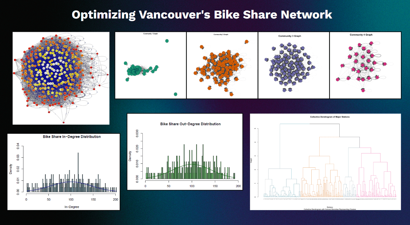
Using igraph, I turned the trip graph into an adjacency matrix and then a distance matrix — inverting edge weights so that high-frequency routes read as "close." Ward's hierarchical clustering then minimized intra-cluster variance to let the network reveal its own communities: four natural clusters of 84, 80, 74, and 26 stations, each with a distinct connectivity signature. Dendrograms and per-cluster network graphs made the structure visible at a glance.
Finding the Stations That Matter
Four centrality lenses, each answering a different operational question. Betweenness (mean 239.2) exposed the bridge stations that traffic must flow through. Eigenvector (mean 0.0188) surfaced the influential hubs wired to other high-traffic nodes. Degree ratios revealed which stations quietly absorb more bikes than they release. Closeness (mean 0.566, range 0.398–0.620) ranked how reachable each station is from everywhere else. Together they turn a flat map of dots into a ranked priority list.
Making It Operational — Power BI & Prediction (in progress)
Analysis only matters if an operator can act on it. I'm exporting cluster membership and centrality scores from R into a clean feature table, joining station latitude/longitude, and building an interactive Power BI dashboard: a geospatial map sizing and coloring each station by centrality, a cluster filter, and a degree-ratio heatmap that flags rebalancing candidates instantly. In parallel I'm developing predictive demand models to forecast imbalance before it happens — moving the project from "here's what the network looks like" to "here's where to send the truck tomorrow."
Key Results
Key Findings
Hierarchical clustering cleanly partitioned the 264-station network into four communities (84, 80, 74, and 26 stations). Cluster 1 showed the highest internal cohesion (avg height 0.529) while Cluster 3 was the weakest (0.201) — a clear signal of underutilized nodes where infrastructure or rebalancing investment yields the most return.
A small set of stations carries the network: stations 222, 76, and 223 dominate betweenness centrality (avg 239.2), acting as critical bridge nodes. If any of these saturates or empties, trip flow across the whole system degrades — making them the highest-priority targets for proactive rebalancing.
Eigenvector analysis identified stations 209, 105, and 103 as the most influential hubs — densely connected to other high-traffic nodes and essential to global network efficiency. These are the stations whose reliability disproportionately defines rider experience.
No sink nodes were found: all 264 stations actively contribute to both inbound and outbound traffic. Yet degree ratios expose significant imbalance — Node 982 (ratio 3.5) absorbs far more trips than it dispatches, a textbook candidate for scheduled bike redistribution.
Closeness centrality flagged stations 176, 81, and 198 as the most accessible network-wide, while peripheral stations 988, 994, and 982 depend on longer paths — quantifying exactly where the network has connectivity gaps and where new stations would most improve coverage.
Conclusion
Network science gives bike-share operators something a live status dashboard never can: a structural diagnosis of why the system behaves the way it does. By ranking stations on how they actually function in the network — bridges, hubs, sinks, dead ends — the analysis turns guesswork into a concrete, zone-based rebalancing plan: keep the high-betweenness bridges stocked, feed the peripheral low-closeness nodes, and watch the imbalanced absorbers like Node 982. Best of all, none of it is Vancouver-specific — the same pipeline runs on any city that publishes open bike-share data. I'm now pushing it further: interactive Power BI dashboards that put centrality on a live map, multi-month data to capture seasonal demand swings, and predictive models that forecast imbalance before it strands a single rider — turning the analysis into a genuine operations tool.
Gallery